I just returned from a wonderful vacation with my husband. It was the first vacation we have taken together without children since our honeymoon. I came back relaxed, sporting a sunburn and with a camera filled with photos.
I knew I would be taking lots of photos of water, since we were going to Lake Michigan. When scrapbooking water photos, I always find it difficult to match the paper. The blues always seem to clash.
So, when I saw the new Travel Light line from We R Memory Keepers, which uses a lot of yellow, green and red, I knew they would be perfect for my pictures and I bought quite a few of the papers before I left.
Here is the first page I made from our vacation ... it features a photo of my husband and I taken by a stranger at the Sleeping Bear Dunes.
The papers are all from We R Memory Keepers. I cut the ones in the middle to 8x8. Then I inked the edges of each paper with Walnut Distress Ink. For the background paper, I folded the corner and used a Craft Glue Dot to secure.
For the smaller papers, I used a distress tool to add a bit of texture and added a few tears here and there. Then, I layered them and used Ultra Thin Glue Dots to hold them in place.
I cut a piece of white card stock to serve as my photo mat and then inked it with Distress Ink and attached my photo and then attached it to the page.
Next, I added twine from My Mind's Eye. I wrapped it around the back of the page, secured it with a Glue Dot and then cut out a small piece of leftover paper and layered it over the top.
For the title charm, I attached a clear charm by Tim Holtz to one of my photos of the dunes with Glossy Accents. This takes a long time to dry -- I let mine dry over night. Then, I trimmed the charm, added a bit of twine and attached it to my page with Craft Glue Dots. Finally, I used the Zig Photo Writer Pen to write the title on top.
For the final touches, I used metal flowers by 7 Gypsies. The one at the bottom features a button from Tim Holtz, which is attached with Craft Glue Dots to the flower and then I used Craft Glue Dots to adhere the flower to the page. The top one is adhered with a brad from Bo Bunny. The little coin is also from Tim Holtz and is also attached with a brad.
I like how the page turned out ... simple, rustic and relaxed -- just like my trip!
Showing posts with label Distress Ink. Show all posts
Tuesday, July 12, 2011
Thursday, July 7, 2011
Pretty Posing Peacocks
It's Candy, returning with another layout idea ....
I take a lot of photos of animals, birds, landscapes and nature. I end up with plenty of beautiful photos, but I always seem to be challenged when it comes to scrapbooking them. It seems all of the products on the market either take away from the photos or are too childish. I have spent hours trying to find the perfect paper and often end up carrying the photos around for years, figuring I will find some inspiration, somewhere, eventually.
So, for these ones, I decided to try something a little different. I worked with plain cardstock, made the photos the stars and then added accents from Crafty Secrets. The journaling block, tag and vintage art piece were all on one sheet. I cut them out, added some Distress Ink and attached them to the page.
To keep it elegant, I used beautiful ribbons from Maya Road and 7 Gypsies. I also added several Dew Drops from Robin's Nest.
For the title, I colored chipboard letters from Maya Road with Distress Ink and then layered a thin coat of Diamond Glaze over the top. I love the shiny, elegant effect. Don't you?
I take a lot of photos of animals, birds, landscapes and nature. I end up with plenty of beautiful photos, but I always seem to be challenged when it comes to scrapbooking them. It seems all of the products on the market either take away from the photos or are too childish. I have spent hours trying to find the perfect paper and often end up carrying the photos around for years, figuring I will find some inspiration, somewhere, eventually.
So, for these ones, I decided to try something a little different. I worked with plain cardstock, made the photos the stars and then added accents from Crafty Secrets. The journaling block, tag and vintage art piece were all on one sheet. I cut them out, added some Distress Ink and attached them to the page.
To keep it elegant, I used beautiful ribbons from Maya Road and 7 Gypsies. I also added several Dew Drops from Robin's Nest.
For the title, I colored chipboard letters from Maya Road with Distress Ink and then layered a thin coat of Diamond Glaze over the top. I love the shiny, elegant effect. Don't you?
Wednesday, May 18, 2011
Handmade Decorative Border
Die cutting machines, decorative edge scissors and punches can make some amazing borders.
But, don't discount stickers and die cuts. They can make unique borders on cards, too.
Just look at this one Candy created ...
First, she created a card out of cardstock. Then she tore and inked papers from Creative Imaginations and then layered them onto the front of the card.
Next, she took a die cut from Creative Imaginations, inked the edges, and used dimensional foam to adhere it.
Then, she ran flower die cuts (from the same package by Creative Imaginations) ran them through the Xyron Sticker Maker to turn them into little stickers and then adhered them to the bottom and right corner of the card.
Using detail scissors, she cut the cardstock and paper away from the areas below the flowers.
Finally, she added a touch of Distress Ink to the bottom edge to finish it off.
Simple and unique.
But, don't discount stickers and die cuts. They can make unique borders on cards, too.
Just look at this one Candy created ...
First, she created a card out of cardstock. Then she tore and inked papers from Creative Imaginations and then layered them onto the front of the card.
Next, she took a die cut from Creative Imaginations, inked the edges, and used dimensional foam to adhere it.
Then, she ran flower die cuts (from the same package by Creative Imaginations) ran them through the Xyron Sticker Maker to turn them into little stickers and then adhered them to the bottom and right corner of the card.
Using detail scissors, she cut the cardstock and paper away from the areas below the flowers.
Finally, she added a touch of Distress Ink to the bottom edge to finish it off.
Simple and unique.
Wednesday, May 11, 2011
Creatively escape to the islands with Candy
Sometimes paper companies create beautiful papers that are, what Candy calls, "unscrappable." As much as we love to look at them, we cannot figure out how to incorporate photos without either covering too much of the paper or taking the focus away from the pictures.
But, every once in a while, a company comes out with a fabulous line that is perfectly scrappable, like the Sonnets of the Sea Collection by Creative Imaginations.
The collection is small -- with just three double-sided papers -- but it covers everything. There is a sheet with island maps, another with travel words and a third with sand and shells. The backsides offer larger shells and two patterns that could be used as mats, backgrounds or letters.
For this design, Candy used one sheet as her background. Tore and inked two others and attached. Then, she cut out one of the shells from leftover paper and adhered it with dimensional dots as an accent. The title was cut out of another paper using a QuicKutz font and the journaling block was taken from another leftover section, torn and inked. Eyelets and a bit of twine finish off the look.
The final result is inexpensive, but elegant and allows the photos to take center stage.
But, every once in a while, a company comes out with a fabulous line that is perfectly scrappable, like the Sonnets of the Sea Collection by Creative Imaginations.
The collection is small -- with just three double-sided papers -- but it covers everything. There is a sheet with island maps, another with travel words and a third with sand and shells. The backsides offer larger shells and two patterns that could be used as mats, backgrounds or letters.
For this design, Candy used one sheet as her background. Tore and inked two others and attached. Then, she cut out one of the shells from leftover paper and adhered it with dimensional dots as an accent. The title was cut out of another paper using a QuicKutz font and the journaling block was taken from another leftover section, torn and inked. Eyelets and a bit of twine finish off the look.
The final result is inexpensive, but elegant and allows the photos to take center stage.
Sunday, March 13, 2011
For Scrapbook Pages, too
Many of the newest and coolest products on the market these days seem to be tailored to cardmakers and altered artists, rather than scrapbookers.
Candy loves playing with the newest tools, but since she is a scrapbooker at heart, she is always looking for ways to apply cardmakers' techniques onto her scrapbook pages.
For this one, she worked with a Sizzix/Tim Holtz Texture Fades Embossing Folder. Because the photos were taken through the gates, windows and openings in the building, which was closed when she visited, she thought the look of an old screen would be the perfect thing to accent the pages.
She embossed pieces of white cardstock with the Gridlock Embossing Folder and then used Pumice Stone Distress Ink to accent them.
For the title, she used a mixture of chipboard letters (most are from Maya Road) and colored them with Spiced Marmalade Distress Ink. They are attached with Art Glitter Designer Dries Clear Adhesive.
The butterflies were stamped on plain white cardstock with a Tim Holtz/Stamper's Anonymous stamp and Ranger Archival Ink in Jet Black, then cut out and colored in Spiced Marmalade Distress Ink. Using a technique taught by Wendy Vecchi, she cut off the antennae when cutting out the image. Then, she reinked the stamp, placed sticky notes over all but the antennae and stamped it directly on her page. Finally, she lined up the cut outs with the stamped images and adhered them with dimensional foam.
Other supplies used: Cardstock: American Crafts, Bazzill; flowers: Bo Bunny; brads: American Crafts (gray), My Mind's Eye (turquoise); computer font: Candy Buzz BTN off the Internet
Candy loves playing with the newest tools, but since she is a scrapbooker at heart, she is always looking for ways to apply cardmakers' techniques onto her scrapbook pages.
For this one, she worked with a Sizzix/Tim Holtz Texture Fades Embossing Folder. Because the photos were taken through the gates, windows and openings in the building, which was closed when she visited, she thought the look of an old screen would be the perfect thing to accent the pages.
She embossed pieces of white cardstock with the Gridlock Embossing Folder and then used Pumice Stone Distress Ink to accent them.
For the title, she used a mixture of chipboard letters (most are from Maya Road) and colored them with Spiced Marmalade Distress Ink. They are attached with Art Glitter Designer Dries Clear Adhesive.
The butterflies were stamped on plain white cardstock with a Tim Holtz/Stamper's Anonymous stamp and Ranger Archival Ink in Jet Black, then cut out and colored in Spiced Marmalade Distress Ink. Using a technique taught by Wendy Vecchi, she cut off the antennae when cutting out the image. Then, she reinked the stamp, placed sticky notes over all but the antennae and stamped it directly on her page. Finally, she lined up the cut outs with the stamped images and adhered them with dimensional foam.
Other supplies used: Cardstock: American Crafts, Bazzill; flowers: Bo Bunny; brads: American Crafts (gray), My Mind's Eye (turquoise); computer font: Candy Buzz BTN off the Internet
Monday, March 7, 2011
It doesn't have to be new
There are tons and tons of new products arriving daily at Scrap Tales right now.
But, you don't always have to use the newest products to make a nice project.
For this card, I used several Riley stamps. I love Riley. I can't help it. He's just so adorable. So, I use his stamps every chance I get. And, since they are still available at the store, I thought it was OK to show you.
But, you don't always have to use the newest products to make a nice project.
For this card, I used several Riley stamps. I love Riley. I can't help it. He's just so adorable. So, I use his stamps every chance I get. And, since they are still available at the store, I thought it was OK to show you.
This card is for my son whose 20th birthday was yesterday. It shows his dream life -- surfing with two lovely ladies ready to wait on him.
To make it, I tore a piece of brown cardstock and then used Distress Ink to add a bit of dimension. I stamped each character with Momento ink on Cryogen paper and then colored them with Copic markers.
I then cut each one out and attached them with Pop-Up Glue Dots.
Then, I went in with Stickles and added them to the flowers, the suns on Riley's shorts and the water because everything needs to sparkle!
Of course, I couldn't let my son have everything he wants for his birthday, so I included a Riley that is a little more "real" on the inside ...
Saturday, January 15, 2011
Duck, Duck Goose
This is Candy, again ...
I wanted to share this page that I made about the friend my husband made at the zoo. If you click on the photo above and read the journaling, you'll learn how much he hates geese. So, you can imagine my surprise when he made friends with this little guy at the Detroit Zoo!
Anyhow, I figured such a special photo opp deserved a very special place in my scrapbook and I eagerly headed to Scrap Tales to pick out the perfect paper.
I went first to the outdoor/camping/nature section of the store, but nothing was just right. So, I wandered over to the beach section to see if there was something there I could use. Eventually, I ended up in the travel section where I found the perfect paper. I would have never thought to look there, but that is where this paper lives. It's the recent travel collection from KaiserCraft and I knew the muted colors would be perfect. And, I figured the compass patterns went with the whole theme of geese following him around wherever he goes.
The rub-ons, which captured some of the feelings I had behind the lens, are part of that same collection.
I wanted to bring out the feeling of nature, so I added the Blossoming Branch from Prima. I used a bit of Art Glitter Glue to hold it in place.
For the title, I inked some chipboard letters in Distress Ink. The others I painted with Crackle Paint to continue the feeling of nature and texture. Most of the letters are from Maya Road -- the "g" has been in my letter case forever.
So, the next time you are stuck for the perfect paper, consider looking in sections of the store that don't seem to fit. You never know what you might find!
I wanted to share this page that I made about the friend my husband made at the zoo. If you click on the photo above and read the journaling, you'll learn how much he hates geese. So, you can imagine my surprise when he made friends with this little guy at the Detroit Zoo!
Anyhow, I figured such a special photo opp deserved a very special place in my scrapbook and I eagerly headed to Scrap Tales to pick out the perfect paper.
I went first to the outdoor/camping/nature section of the store, but nothing was just right. So, I wandered over to the beach section to see if there was something there I could use. Eventually, I ended up in the travel section where I found the perfect paper. I would have never thought to look there, but that is where this paper lives. It's the recent travel collection from KaiserCraft and I knew the muted colors would be perfect. And, I figured the compass patterns went with the whole theme of geese following him around wherever he goes.
The rub-ons, which captured some of the feelings I had behind the lens, are part of that same collection.
I wanted to bring out the feeling of nature, so I added the Blossoming Branch from Prima. I used a bit of Art Glitter Glue to hold it in place.
For the title, I inked some chipboard letters in Distress Ink. The others I painted with Crackle Paint to continue the feeling of nature and texture. Most of the letters are from Maya Road -- the "g" has been in my letter case forever.
So, the next time you are stuck for the perfect paper, consider looking in sections of the store that don't seem to fit. You never know what you might find!
Wednesday, December 22, 2010
Last-minute gift idea
Need one more holiday gift?
There is still time to make an amazing bookmark, like this, with products you probably already have at home. Here's how Candy made this one:
Cut a piece of cardstock to the size of the bookmark you want. (Candy used white)
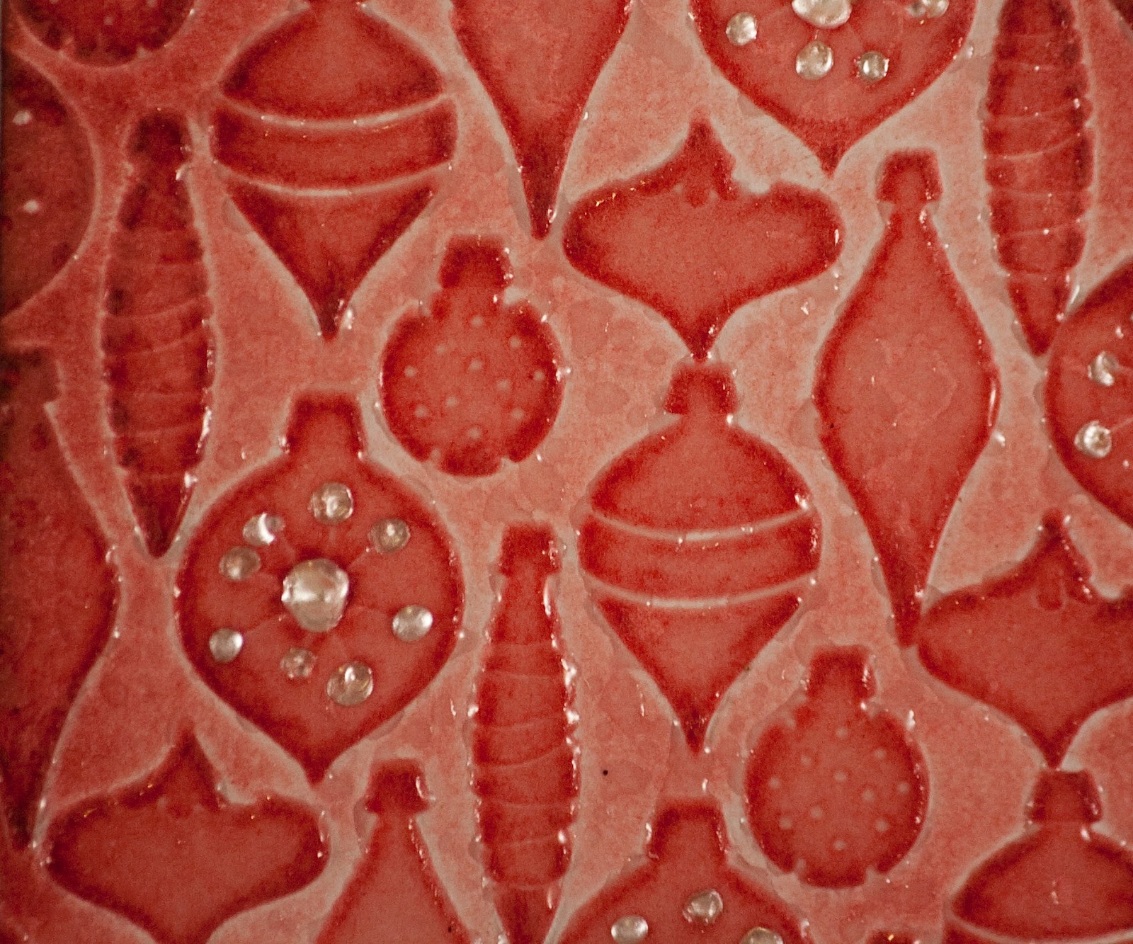
Place it in the Sizzix Textured Impressions Embossing Folders (or one of the Tim Holtz folders would work, too) and emboss with the Big Shot or similar cutting tool. (This is the Christmas and Thin Ice set.)
Round the corners using a corner rounder.
Lightly apply Barn Door Distress Ink with an ink applicator. This will add color to the raised areas and a hint to the rest.
Then, to add a bit more dimension, go over it again, with an even lighter hand, with Fired Brick.
Here's the cool part ...
Turn the Distress Ink Embossing Pad over and lightly run it across the surface of the tag (or bookmark). Don't worry about it being perfect.
Now, add UTEE and heat.
It should look something like this ... almost like the ornaments are glass! When Candy made hers, the ornaments near the edges of the paper didn't get quite as much UTEE, but they still look great.
Now, add Ranger's new Liquid Pearls to the dots on the ornaments for even more texture and dimension.
Candy also added a sticker from the new Seasonal Salvage Stickers by Tim Holtz, a mini safety pin, a strip of ribbon (colored with Distress Ink), a scrap of ribbon and the mini brads by Tim Holtz.
To make the bookmark a little thicker, and to cover the back side, Candy attached another piece of white cardstock to the back, trimmed it to fit, and then went around the entire edge with Fired Brick Distress Ink.
The Crop-a-Dile easily punches a hole at the top for an eyelet. Candy then added some of the Baubles and a Swivel Clasp by Tim Holtz and a bit more ribbon to the top.
It could be a bookmark or a tag for a holiday gift, but it is pretty enough to hang on the tree!
There is still time to make an amazing bookmark, like this, with products you probably already have at home. Here's how Candy made this one:
Cut a piece of cardstock to the size of the bookmark you want. (Candy used white)
Place it in the Sizzix Textured Impressions Embossing Folders (or one of the Tim Holtz folders would work, too) and emboss with the Big Shot or similar cutting tool. (This is the Christmas and Thin Ice set.)
Round the corners using a corner rounder.
Lightly apply Barn Door Distress Ink with an ink applicator. This will add color to the raised areas and a hint to the rest.
Then, to add a bit more dimension, go over it again, with an even lighter hand, with Fired Brick.
Here's the cool part ...
Turn the Distress Ink Embossing Pad over and lightly run it across the surface of the tag (or bookmark). Don't worry about it being perfect.
Now, add UTEE and heat.
It should look something like this ... almost like the ornaments are glass! When Candy made hers, the ornaments near the edges of the paper didn't get quite as much UTEE, but they still look great.
Now, add Ranger's new Liquid Pearls to the dots on the ornaments for even more texture and dimension.
Candy also added a sticker from the new Seasonal Salvage Stickers by Tim Holtz, a mini safety pin, a strip of ribbon (colored with Distress Ink), a scrap of ribbon and the mini brads by Tim Holtz.
To make the bookmark a little thicker, and to cover the back side, Candy attached another piece of white cardstock to the back, trimmed it to fit, and then went around the entire edge with Fired Brick Distress Ink.
The Crop-a-Dile easily punches a hole at the top for an eyelet. Candy then added some of the Baubles and a Swivel Clasp by Tim Holtz and a bit more ribbon to the top.
It could be a bookmark or a tag for a holiday gift, but it is pretty enough to hang on the tree!
Wednesday, December 15, 2010
Inspired by Tim Holtz
Tim Holtz just finished this year's 12 Tags of Christmas ... on Day 2, he showed us how to make a custom ink pad for stamps. You can find the instructions here.
Candy was inspired to try the technique using a Santa stamp.
Here's a closer look ...
Candy embossed the image with UTEE (the only clear embossing powder she had on hand) immediately after stamping it. Who knew you could get such unique results by embossing Distress Ink!
Candy was inspired to try the technique using a Santa stamp.
Here's a closer look ...
Candy embossed the image with UTEE (the only clear embossing powder she had on hand) immediately after stamping it. Who knew you could get such unique results by embossing Distress Ink!
Thursday, December 2, 2010
Wendy Vecchi Plaid
Blogs are meant to inspire and Wendy Vecchi's recent blog post about making plaid with Tim Holtz's Tissue Tape inspired Candy Spiegel, instructor and design team member at Scrap Tales.
Here are Wendy's instructions on making plaid ...
And, here is what Candy was inspired to create:
For directions, visit Candy's blog at www.candyspiegel.wordpress.com
Then, try making your own plaid!
Here are Wendy's instructions on making plaid ...
And, here is what Candy was inspired to create:
For directions, visit Candy's blog at www.candyspiegel.wordpress.com
Then, try making your own plaid!
Subscribe to:
Posts (Atom)